Liquidapsive
Achtung:Die Navigation zu anderen Seiten dieser Webpräsenz wird durch ein JavaScript behindert. Man kann dies testen, in dem man JavaScript deaktiviert.
Auf dieser Seite werden vier unterschiedliche Gestaltungsvarianten für Webseiten behandelt:
- statisch
- liquid
- adaptiv
- responsiv
Statisch
Statische Layouts sind die traditionell im Web Webdesign: ein Design, dass irgendwie in der Mitte des Bildschirms platziert ist und bei dem man horizontal scrollen muss, wenn der Bildschirm kleiner ist als das Design. Eine Reaktion auf diese Gestaltungsform sind sogenannte M dot Websites (m.), bei denen auf der Basis einer Serverseitigen Browserweiche eine komplett andere Website ausgeliefert wird, wenn ein Besucher mit einem Gerät kleinerer Auflösung die Seite ansurft.
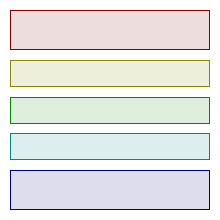
Liquid
Liquid (auch "Fluid") ist ein Webdesign, dass sich auf Grund prozentualer Vorgaben kontinuierlich an die Größe des Ausgabefensters anpasst. Tendenzilell hat diese Methode ihre Grenzen bei besonders kleinen oder besonders großen Ausgabegeräten.
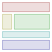
Adaptiv
Adaptives Design wird durch eine Aufeinanderfolge unterschiedlichen Layouts für die unterschiedlichen Bildschirmauflösungen charakterisiert. Innnerhalb eines layouts ändert sich die Größe der dargestallten Elemente nicht. Im Grund kann man sich ein adaptives Layout als Aufeinanderfolge von statischen Layouts vorstellen.
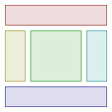
Responsiv
Beim responsiven Layout hat man auch unterschiedliche Layouts für unterschiedliche Bildschirmauflösungen. Jedoch werden innerhalb eines Layouts die einzelnen Elemente dynamisch skaliert, wenn sich die Fenstergröße ändert. Im Grund kann man sich ein responsiv Layout als Aufeinanderfolge von fluid Layouts vorstellen.
How To Use
Ever wondered what the difference between Adaptive, Responsive, Static and Liquid sites is? Had someone try and explain it only to be left more confused?
Pick a flavor from the drop down on the top of the page then drag your window narrower and wider, taller and shorter. It will make much more sense when you see for yourself how the approach works.
Adaptive
Adaptive is characterized by having defined layouts for different resolutions. Within each layout, resizing the window does not change the layout.
You can think of Adaptive as a series of Static layouts.
Liquid
Liquid (also called "Fluid") is characterized by scaling the width of parts of the design relative to the window. It tends to fail when the window is much smaller or much larger than it was originally designed for.
Responsive
Responsive is characterized by having defined layouts for different resolutions. Within each layout, the design is liquid and resizes the width of elements relative to the changing window size.
You can think of Responsive as a series of Liquid layouts.
Static
Static layouts are the traditional web: one design that sits in the center of the page and requires horizontal scrolling if the window is too small for it. M dot sites are the traditional answer to this, providing a wholly separate site for a lower resolution - and all the work of creating a separate site.

Title
Summary summary summary summary summary summary
Content content content content content content content content content content content content content content content content
Link
Title
Summary summary summary summary summary summary
Content content content content content content content content content content content content content content content content
Link